Dunham
in-house rebrand of a parent company and 2 subsidaries
lead of strategy, lead of Design
illustrator, photoshop, indesign
research, presentation
Using Strategy and Design to help a $7 billion investment firm highlight its identity & stand out in a crowded market.
The challenge
Bring out the brand voice
Dunham was founded over 40 years ago on two radical ideas: put financial advisors first, and only get commision when investors succeed. What began as a challenge to industry norms quickly became the foundation of a company defined by empathy, accountability, and forward-thinking.
In 40 years, Dunham grew from a single employee to a team of over 100, with two trust companies, clients in 48 states, and $7 billion under advisory. Recognition came from BBC News, Reuters, and The Wall Street Journal. Business success was undeniable, but the brand hadn’t kept pace: touchpoints told no clear story. The identity felt generic, the website outdated and fragmented, and the company’s values were invisible. Through strategy and design, we needed to transform Dunham’s brand to highlight and convey its unique traits of empathy, accountability, and forward-thinking. This repositioning and clarification of identity would give the market a fast, accurate view of who Dunham is, how they are different, and how they can help.
the core foundation
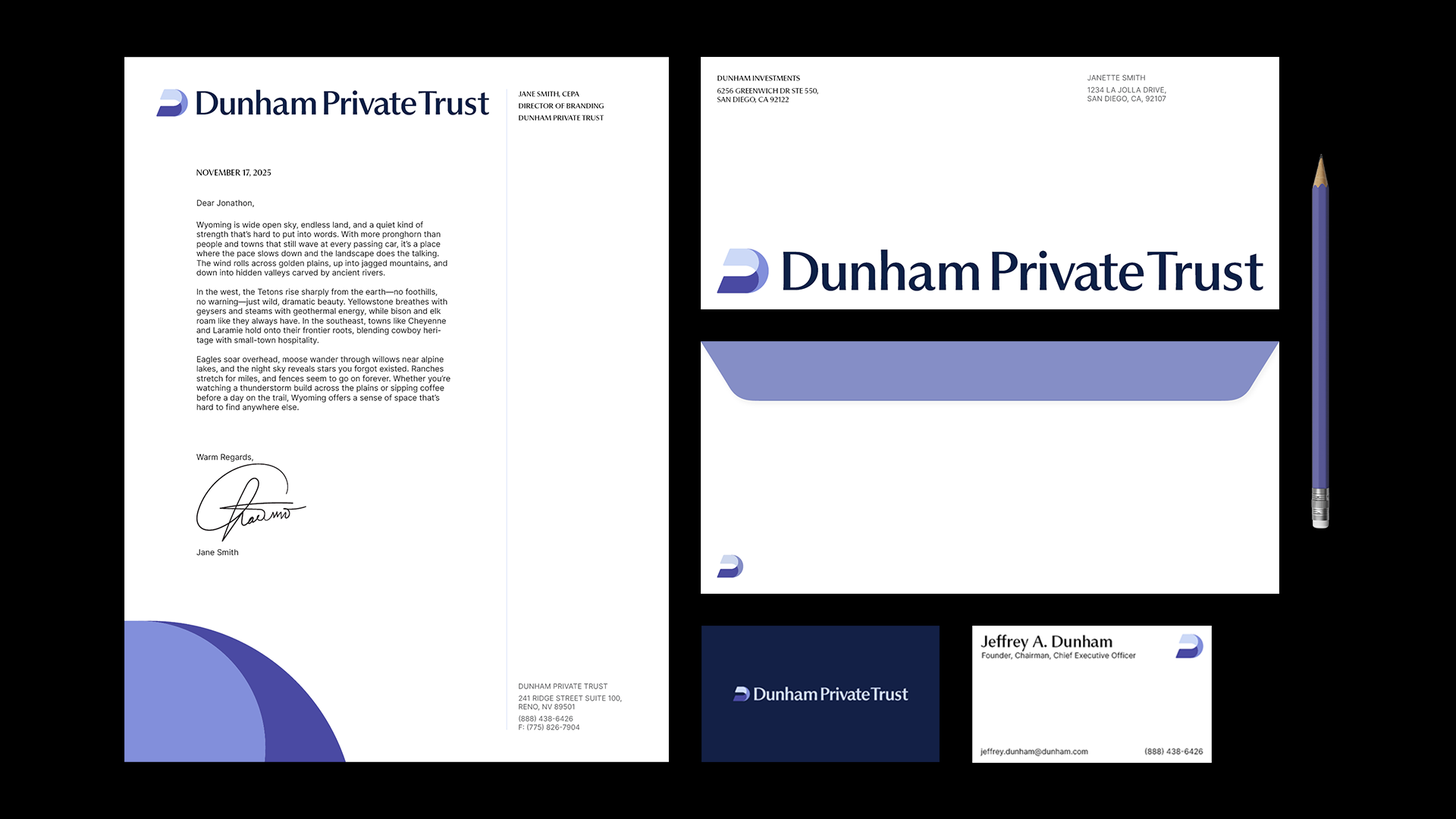
LOGO REDESIGN
Sending the sailboat into the sunset
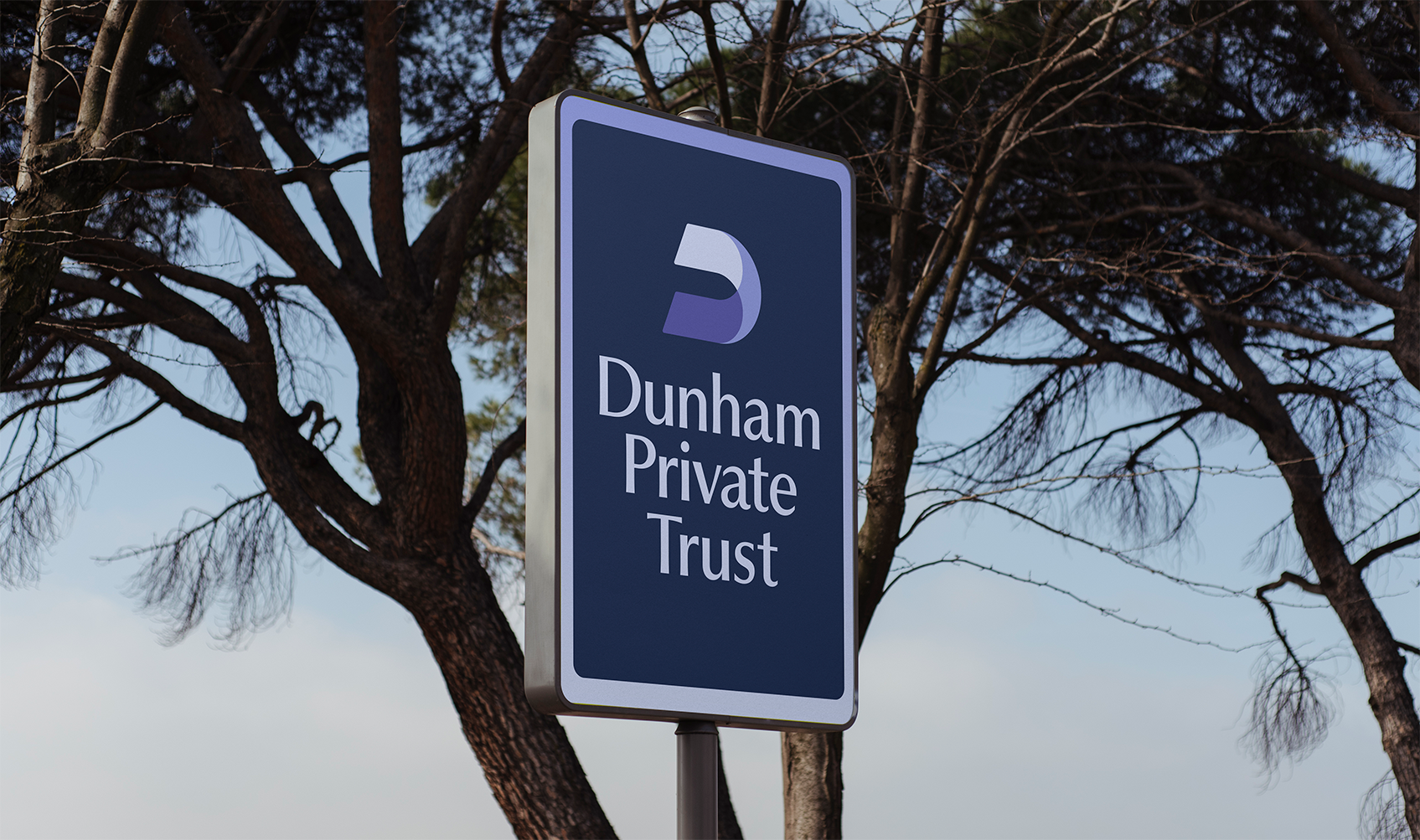
For almost 20 years, Dunham carried a sailboat logo that served its purpose in the early days but never had real conceptual grounding. As the company expanded into landlocked states, its relevance faded, and both employees and clients began questioning its significance. In financial services, tying identity to a literal object can be limiting, so abstraction became the natural path forward. An abstract mark allows for open interpretation, conceptual flexibility, and the ability to evolve with the company as it continues to grow.
The old logo also felt off-centered and boxed-in. The new design introduces circular motion and balanced geometry, creating a sense of harmony and openness. Subtle use of proportion and spatial principles shaped a mark that feels calm, friendly, purposeful, and built to last.
old logos
New Logos

New COlors

Logo Construction
Logo Conception
Typeface Selection
Heritage & modern
For Dunham’s hero typeface, I selected Pangram Pangram’s Museum, a serif with the right balance of professionalism and personality. Its lightly flared serifs and double-story “a” give the logotype warmth while maintaining a sense of heritage and credibility within financial services. I also elected to use title case rather than all caps, echoing our shift toward a friendlier, more approachable voice instead of something loud and sharp.
To support it, I chose Inter as the workhorse font. It is versatile, highly legible, and scalable across mediums which ensures consistency and clarity in every application. Being free and open-source also made implementation seamless across the company while offsetting the licensing cost of the hero font.
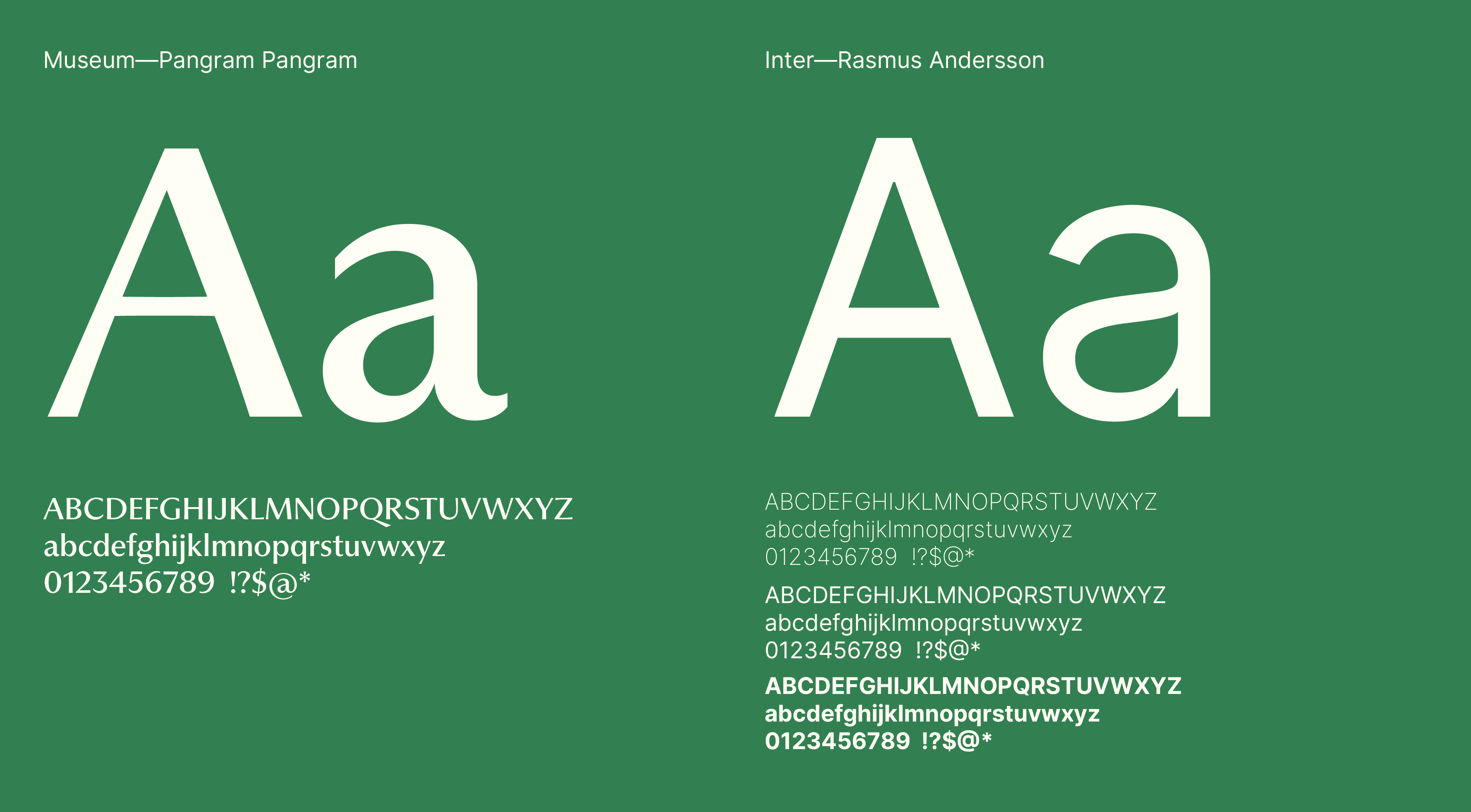
Museum & Inter
Renaming
A logical consolidation
Dunham, formerly Dunham & Associates Investment Council, Inc., was too long to use in practice. Everyone already shortened it, so we made it official. The simpler name is direct, confident, and aligned with how people actually speak about the company.
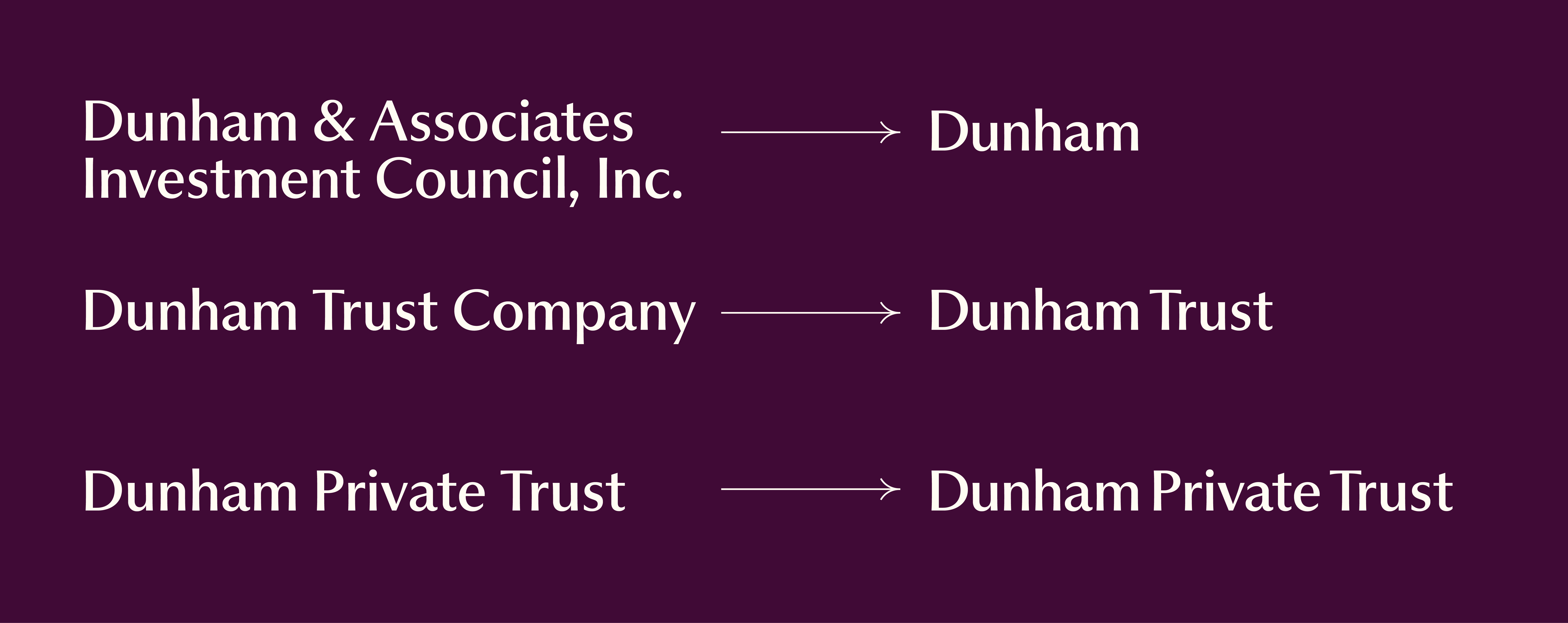
Name shortening
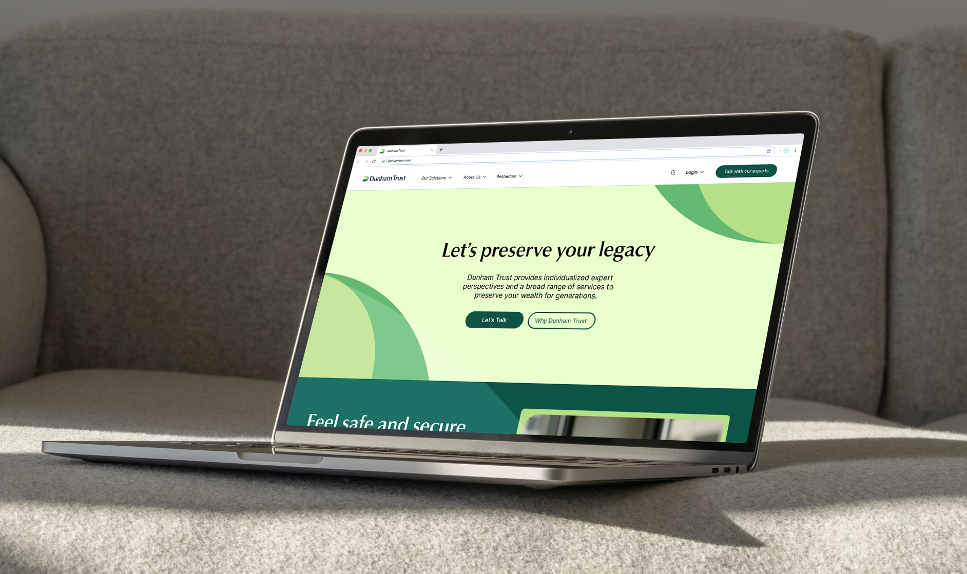
Applications


Achchha masaala
Material+

