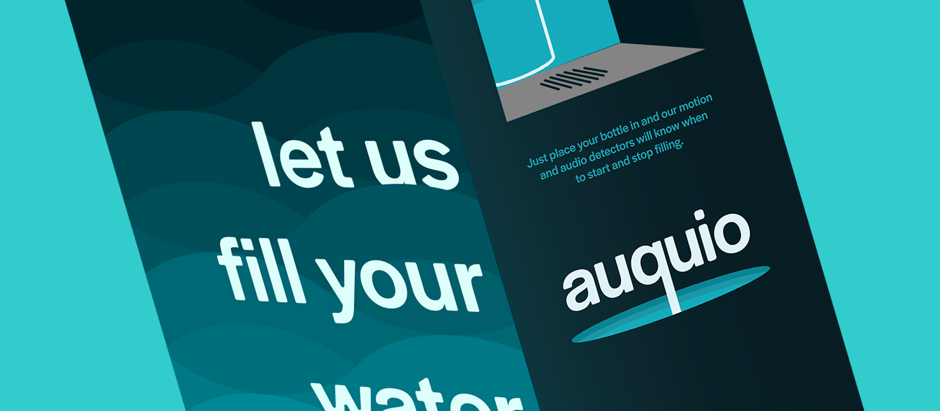
Auquio
experiential design
brand identity, production strategy, naming
illustrator, photoshop, dimension
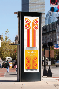
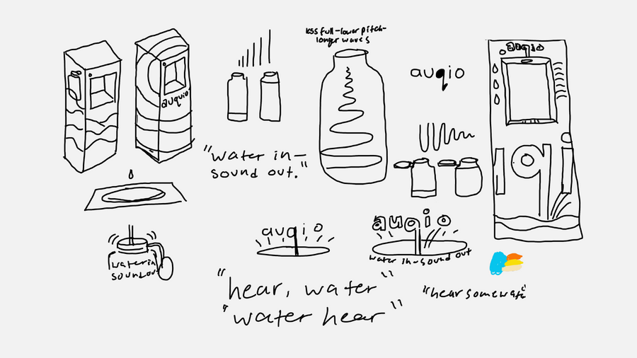
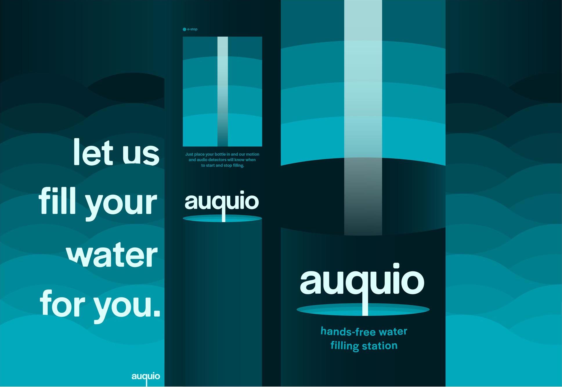
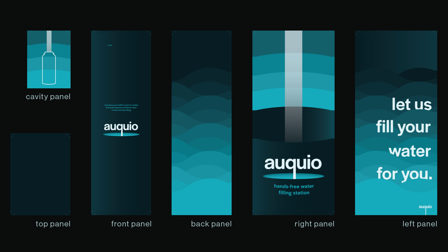
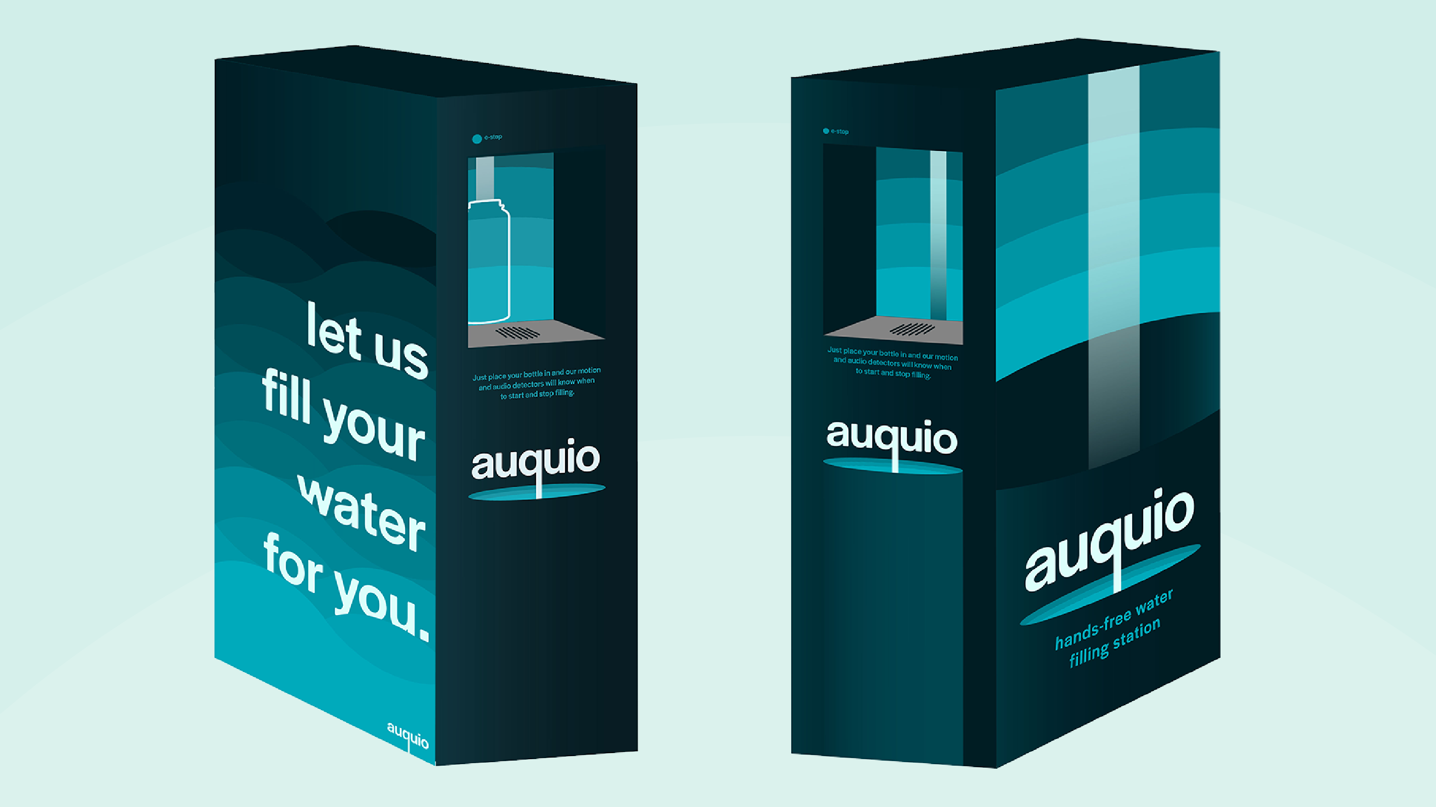
Brand identity, production strategy and naming for this high-tech and futuristic water bottle filling station
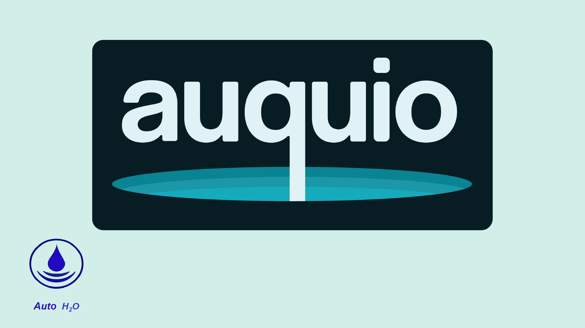
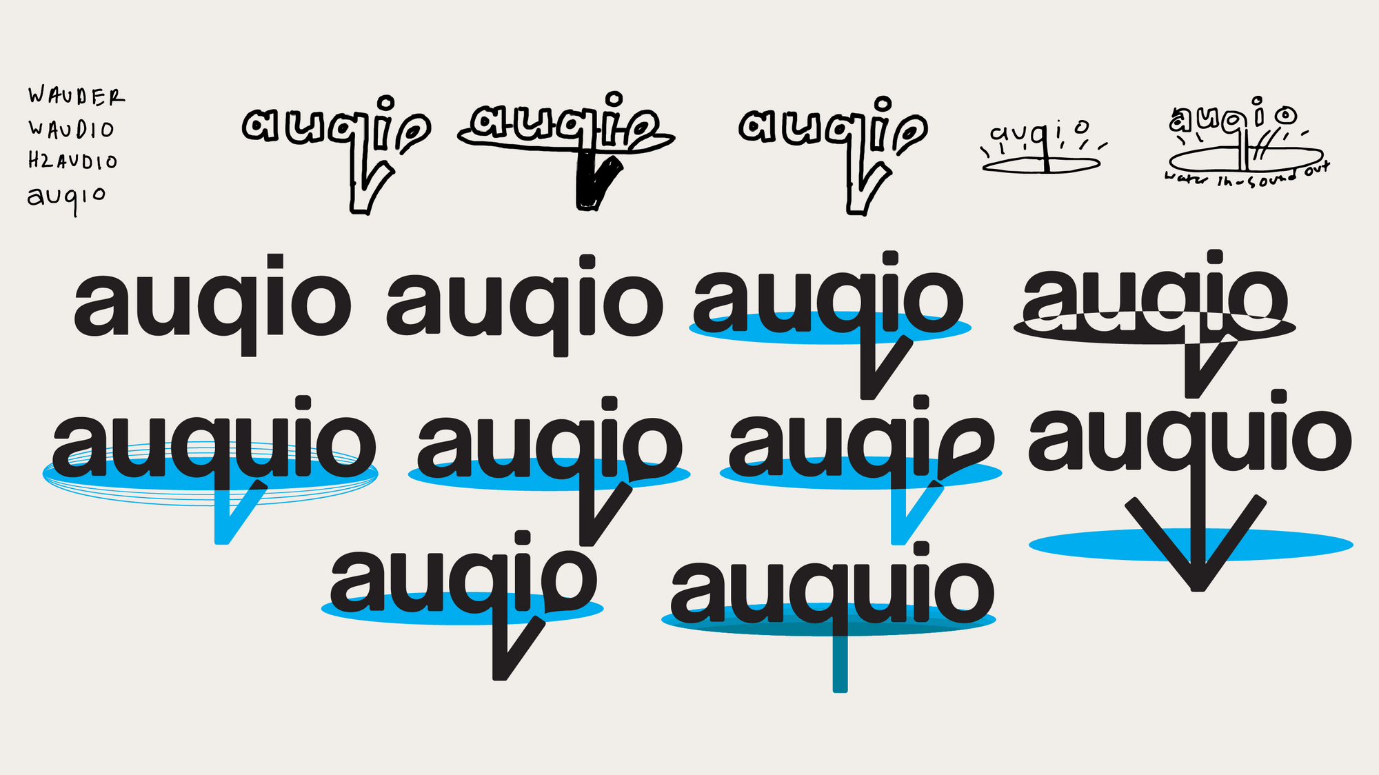
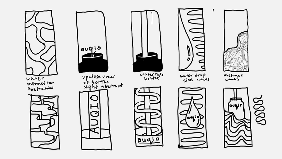
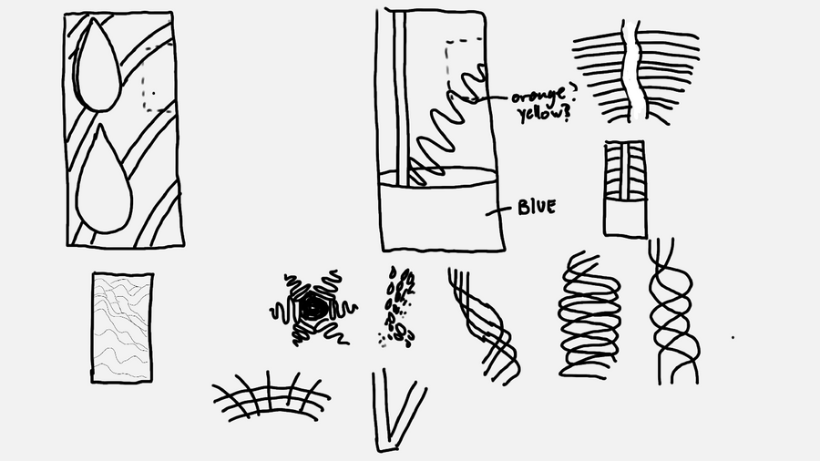
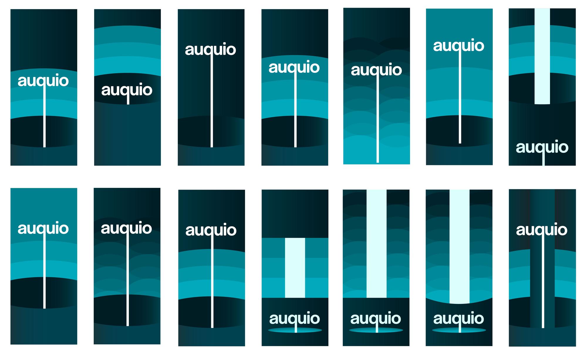
For my logo and rebrand of the device, I wanted to convey the aspect of water falling and sound rising. The team was open and encouraging of a name change so I decided to incorporate the two words audio and aqua to tie the two major elements of their product together.
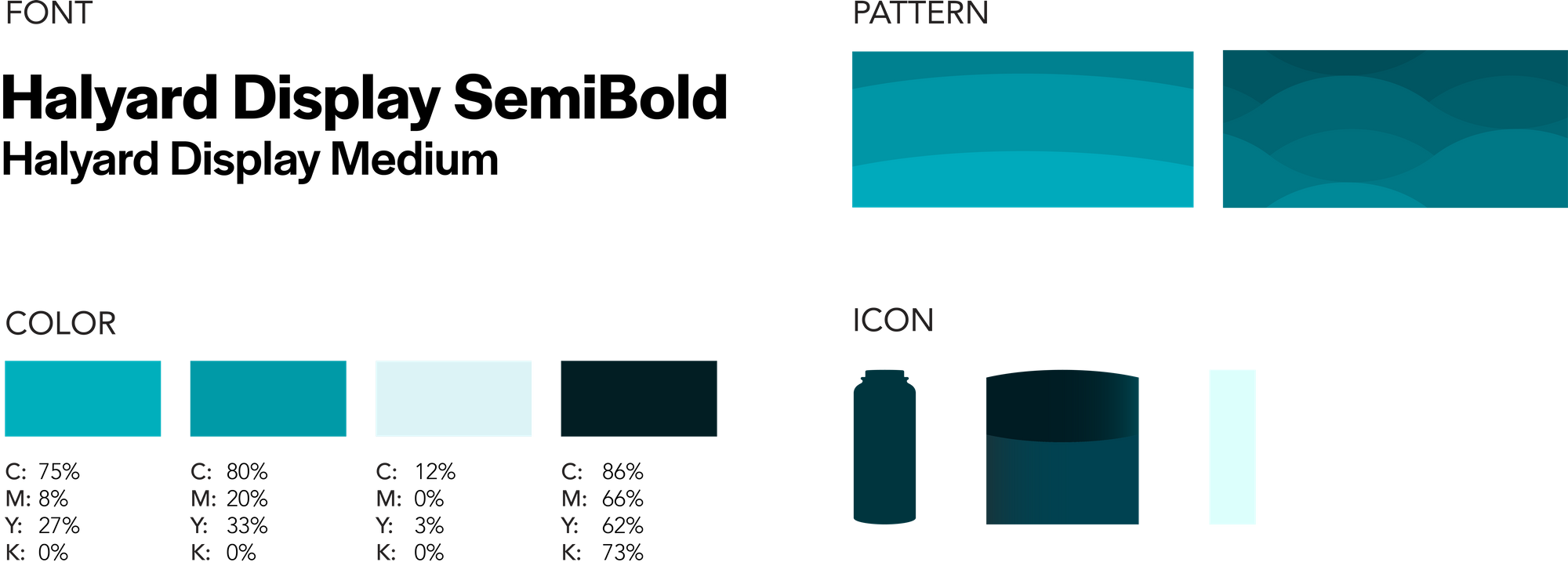
After doing my visual research I began my system definition. I decided to go with a monochromatic design of shades of blue. The darkest color was a deep blue and the lightest was a light blue. I also created a gradient of color throughout the design using these monochromatic color shades. My patterns of waves symbolized the waves of sound and water alike.

Greening Lemon Grove
Rubicon


© 2026 Brian Leenerts. All Rights Reserved.
website BUILT From Scratch by brian leenerts in webflow. Sax typeface paired with inter.