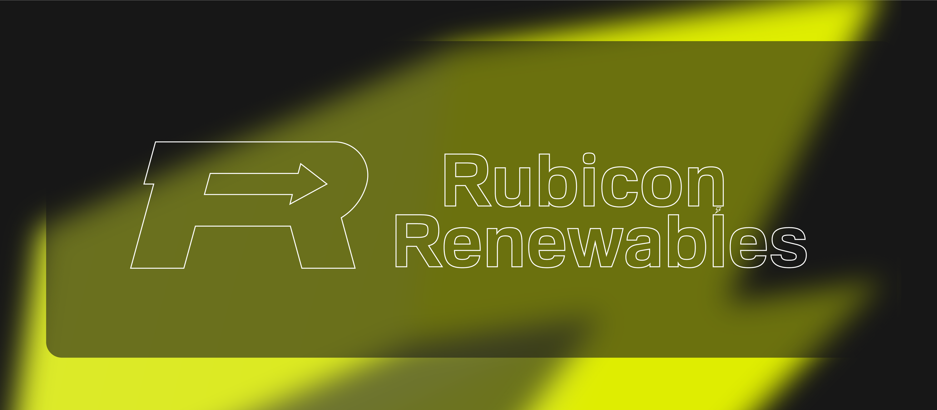
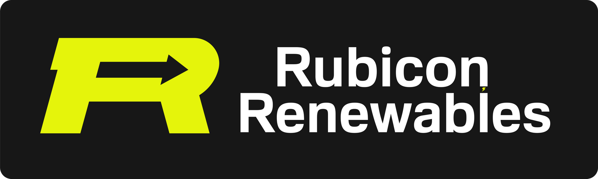
Rubicon
client company branding
brand identity, copywriting, print and web
illustrator, photoshop, dimension
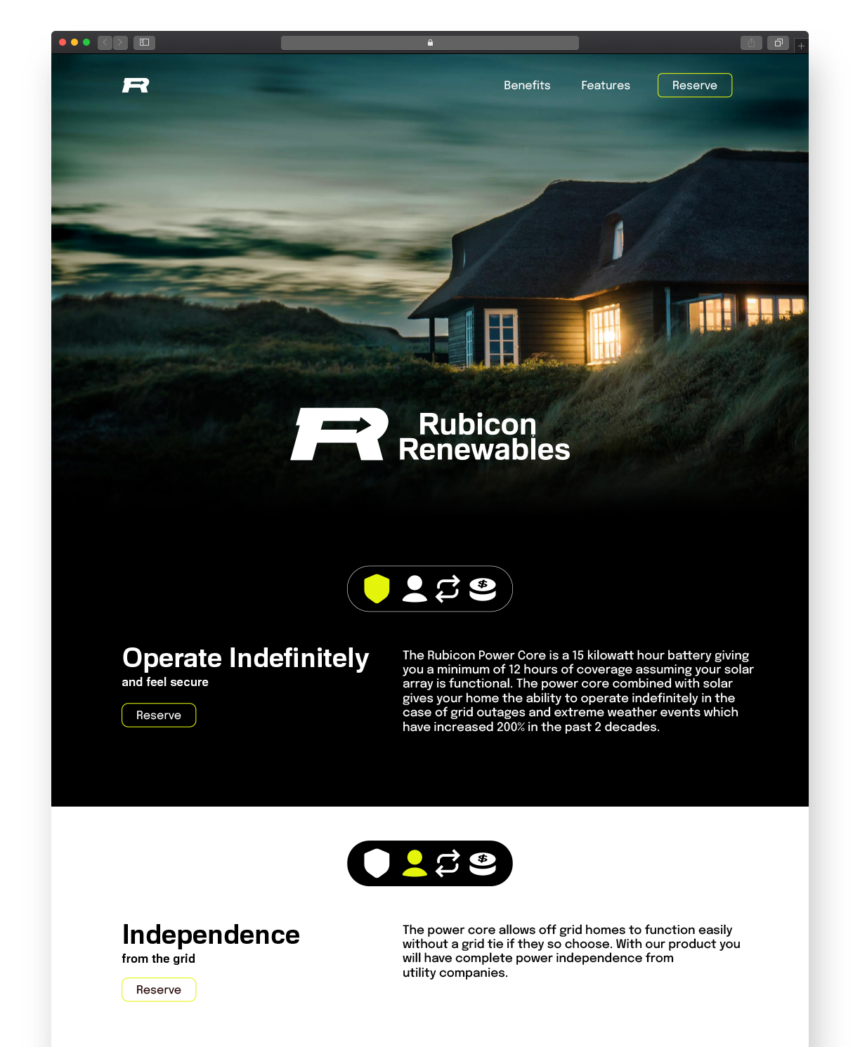
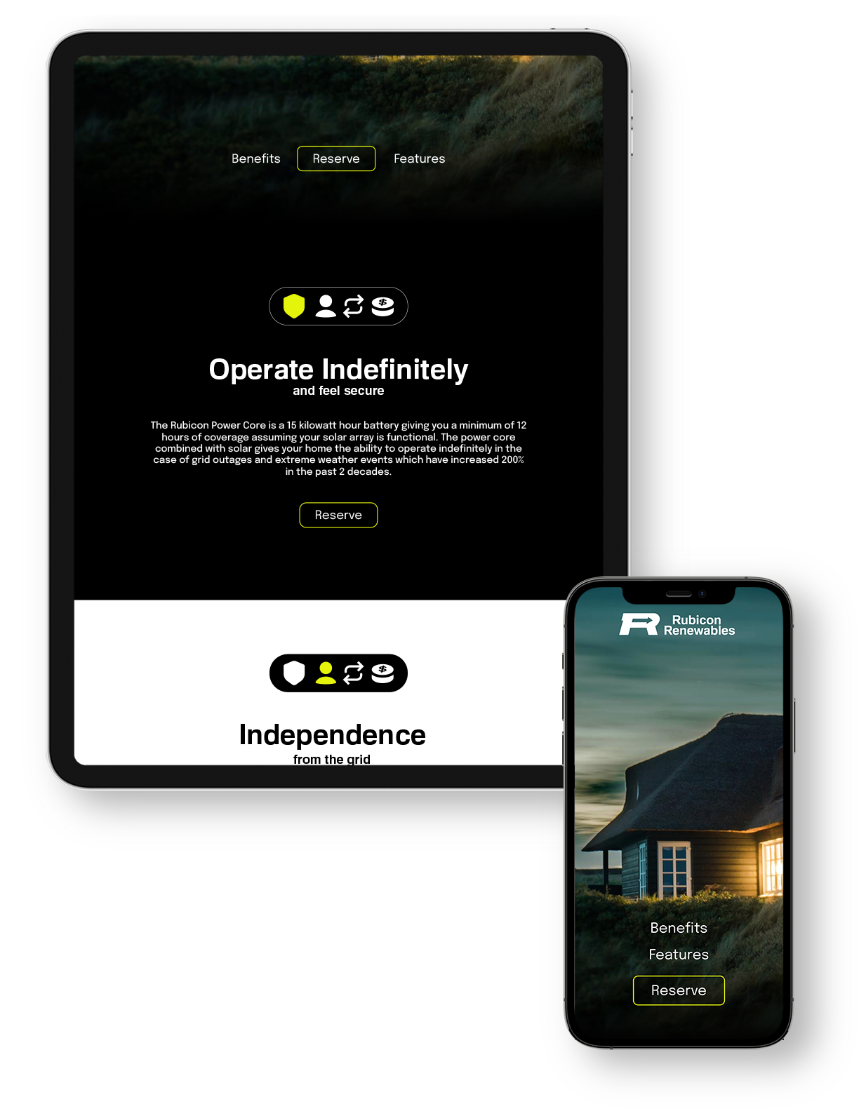
Brand Identity for a market disrupting renewable energy startup.
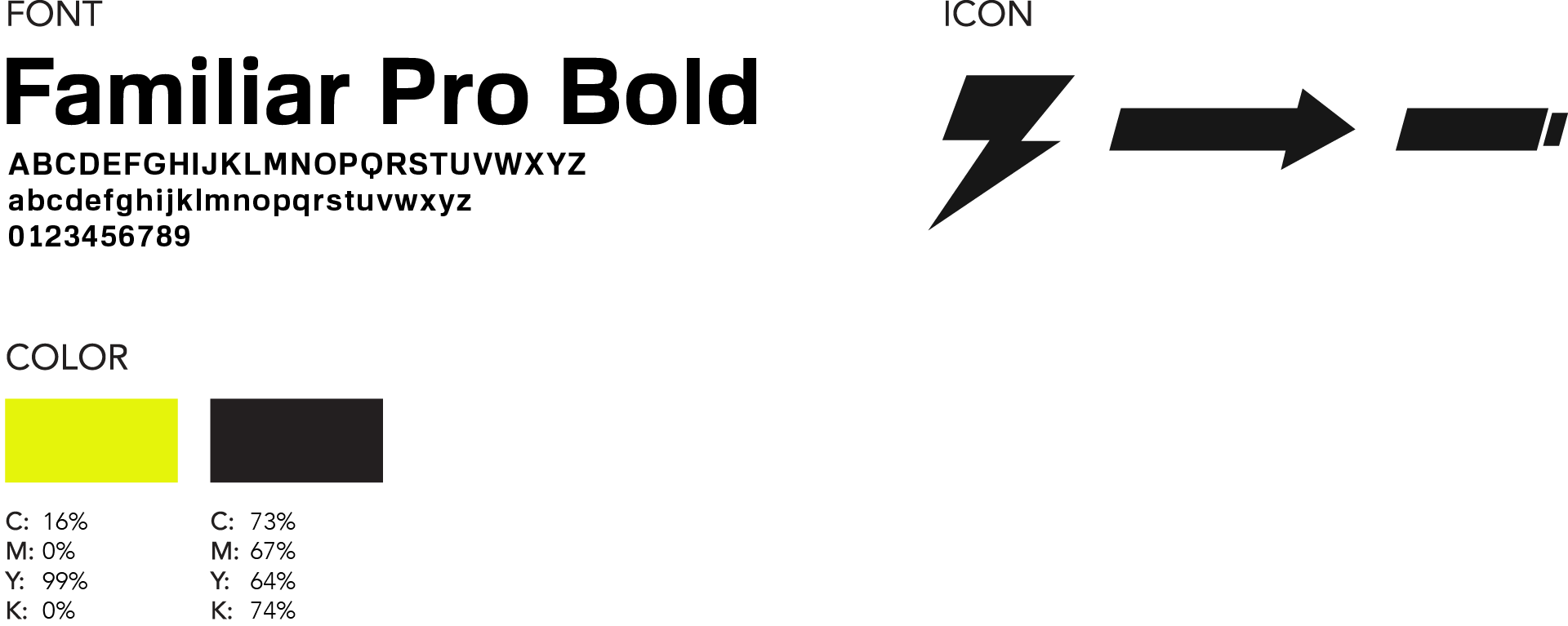
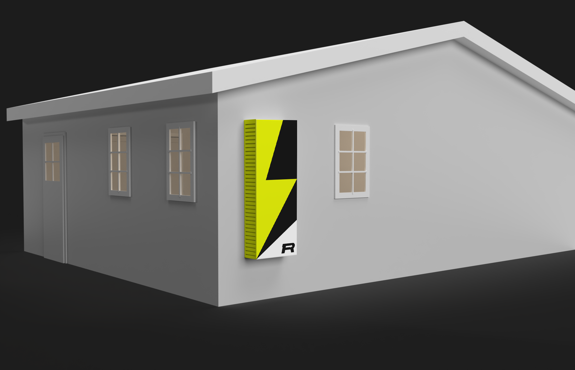
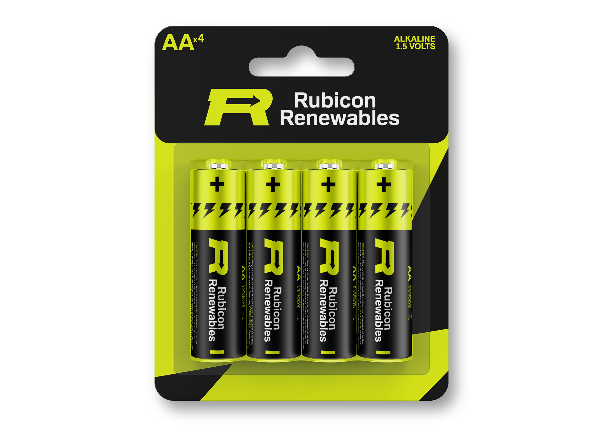
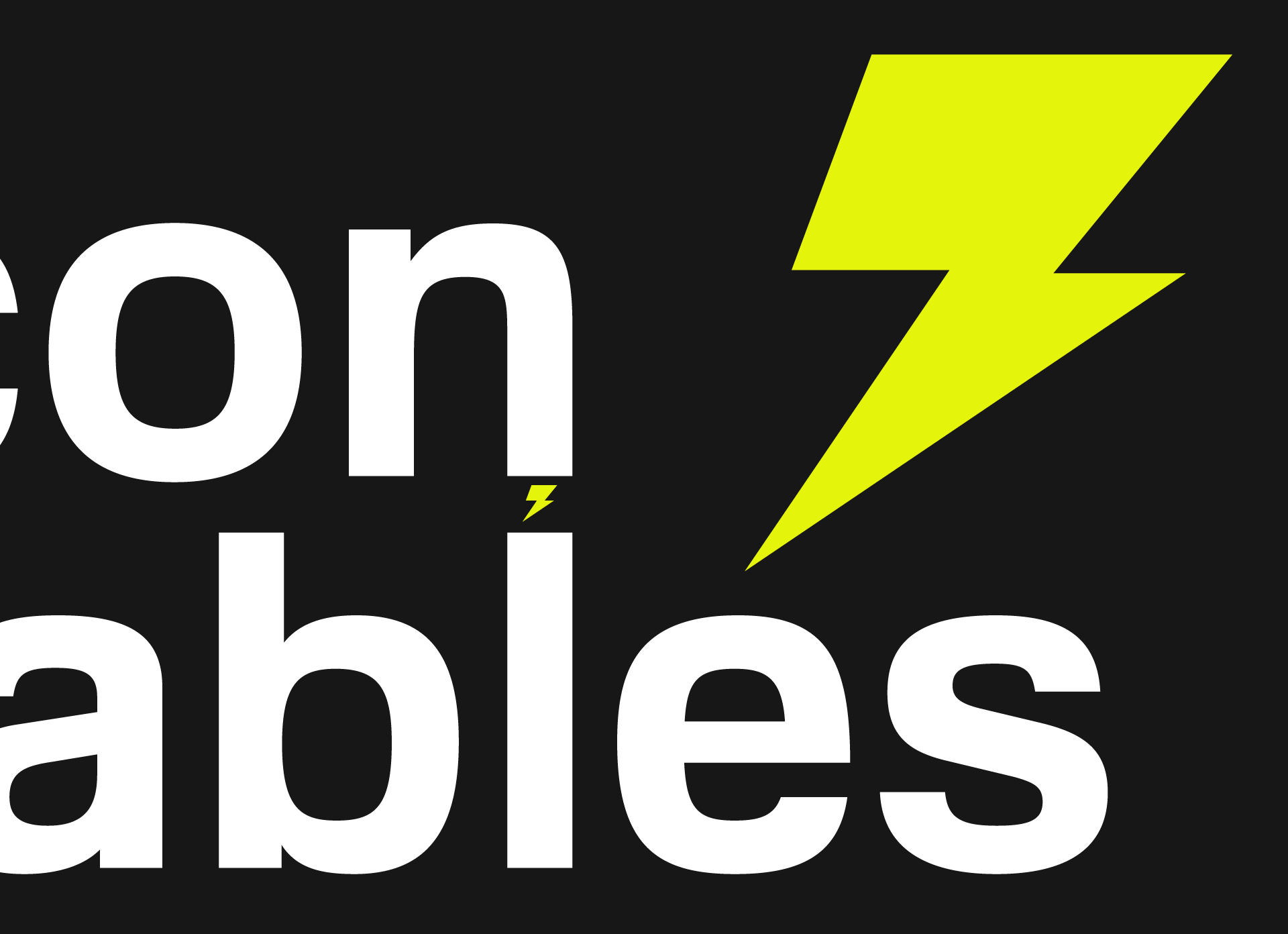
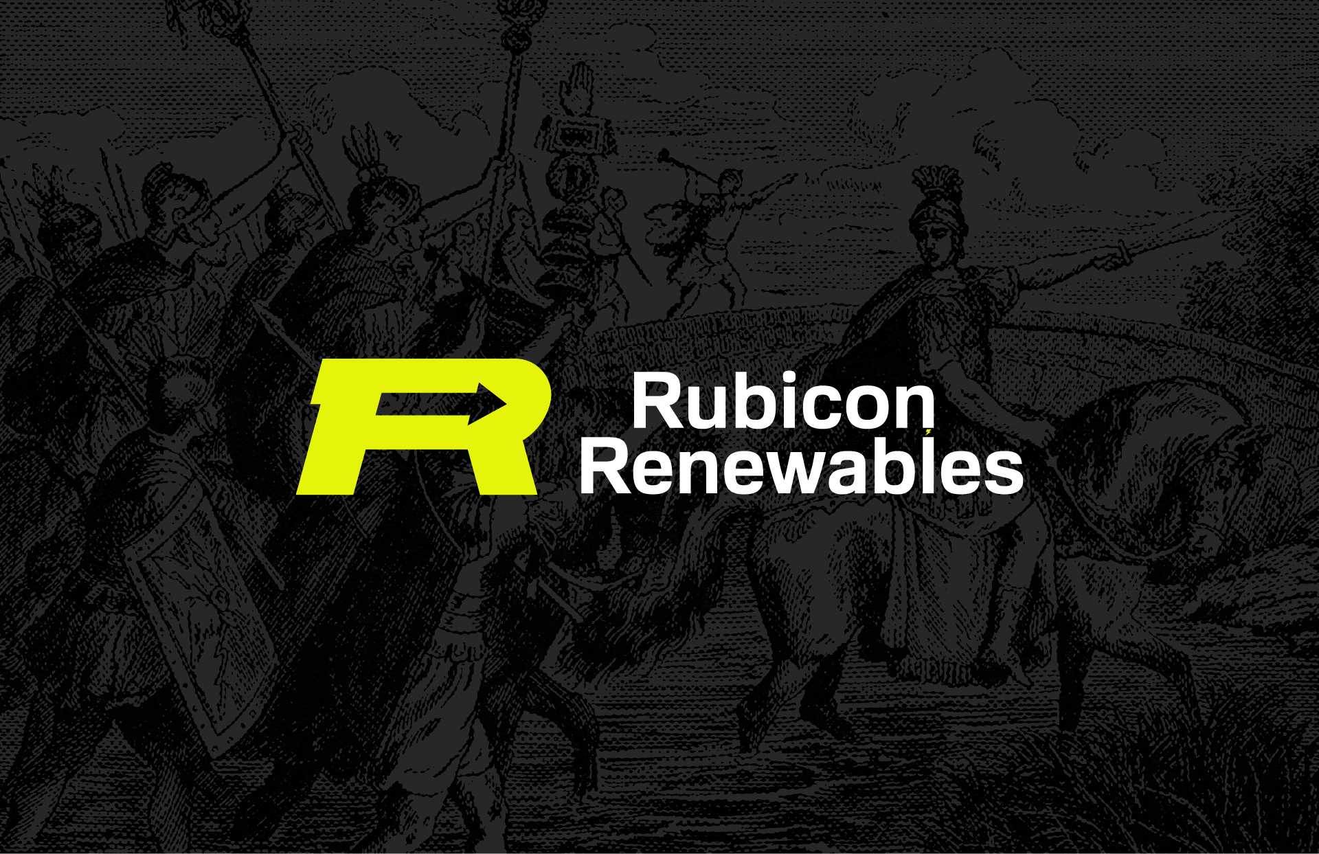
The single initial ‘R’ logomark is representative of the company’s alliterative initials. This forward thinking, disruptive company looks to follow the bold and brave direction set forth by Julius Caesar in his leadership across the Rubicon River. The arrow represents the no-looking-back ideologies that Rubicon Renewables adheres to. The arrow also alludes to arrows commonly found in recycling graphics. The jagged edge on the left side of the R is representative of lightning and electricity. This strong logo looks like it has been around for centuries and can stand the test of time.
The bright yellow signifies electricity and the bold nature of the service that Rubicon is providing. When paired with a dark background it grabs the consumer’s eye and demands their attention and when paired with white it looks clean, fresh, and bright. Familiar Pro is a font that communicates modernity and innovation without sacrificing legibility and formality. It’s good for creating statements and conveying important messages.
I started my creation process for this logo with wordmapping and word association. I began my ideation by sketching recycling and exploring logos. From there I started playing with the positive/negative relationship in the logomark. I tried creating an ‘R’ from arrows but eventually decided to incorporate an arrow into the ‘R.’ Once I arrived at the logomark I liked the most I implemented the company name into it. I experimented with different justifications, cases, and typefaces of the text until I found one that I felt fit the company the best.

Auquio
Achchha Masaala


© 2026 Brian Leenerts. All Rights Reserved.
website BUILT From Scratch by brian leenerts in webflow. Sax typeface paired with inter.